Why the Projects That Photograph Best Aren't Always the Ones That Work Best
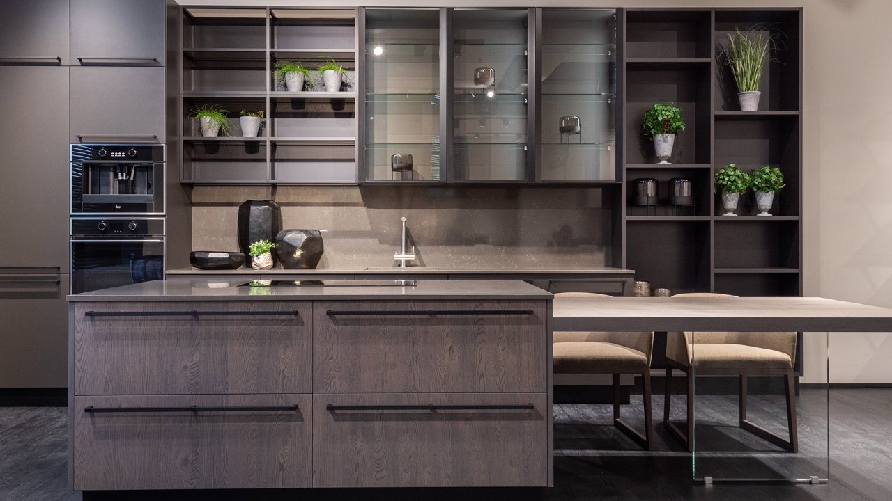
There’s a specific kind of kitchen that photographs extraordinarily well. Dark, matte cabinet faces. Open shelving styled with a few perfectly placed plants and minimal ceramics. A large island with no visible handles, in a contrasting material. Dramatic lighting that catches the texture of the stone countertop. In a magazine spread or a portfolio slideshow, it looks like the ideal kitchen.
Ask someone who’s cooked in it for six months whether it still looks that way.
The gap between photographically successful spaces and functionally successful ones is real, and it shows up consistently in cabinetry portfolios. Understanding the gap — knowing which design choices are made for the camera and which ones survive contact with daily life — is one of the most useful things a buyer can bring to the portfolio review.
Open Shelving: The Design Choice That Looks Best Empty
Open shelving is among the most photographed features in contemporary kitchen design, and among the most complained-about features in actual use. The reason is simple: open shelving looks excellent when it’s been styled by a photographer with a selection of identical neutral vessels, a few green plants, and nothing that resembles actual kitchen supplies. It looks significantly less excellent when it holds the real contents of a working kitchen — mismatched glasses, spice jars with different label orientations, the boxes and containers that actual food comes in.
Beyond appearance, open shelving collects grease and dust in a kitchen environment. Every surface within reach of cooking vapours builds up a film that requires regular cleaning. Closed cabinet doors eliminate this maintenance burden entirely and don’t require you to curate your possessions into something photographable.
The open shelving in a portfolio photo is almost always staged. The question worth asking about any project with extensive open shelving is: what does this look like after a year of actual use, not on the day it was photographed?
Handle-Free Cabinets: The Detail That Creates Daily Friction
Push-to-open or J-pull handle-free cabinet designs read beautifully in photography — uninterrupted surfaces, clean sight lines, no hardware to date the design. In daily use, they introduce friction that isn’t apparent in a photograph.
Push-to-open mechanisms require a deliberate action — a specific kind of push at a specific location — that becomes reflexive after a few weeks but never becomes as fast as a pull handle. On high-traffic cabinets like the drawer below the cooking surface or the door to the bin, the cumulative interaction difference over a year is meaningful.
More significantly, push-to-open mechanisms have a higher failure rate than pull hardware and are more disruptive when they fail — because there’s no alternative way to open the cabinet. A drawer with a handle can be opened by its edge if the hardware fails. A push-to-open drawer that’s malfunctioning requires a service call.
None of this shows up in a portfolio photo. The photo shows the finished appearance; the mechanism is invisible.
Dark Matte Finishes: High Maintenance That Photography Doesn’t Show
Dark matte cabinets show fingerprints more clearly than any other finish, and they show them in a way that’s difficult to address. A gloss surface can be wiped clean with a damp cloth and returns to looking perfect immediately. A matte surface requires more careful cleaning and can develop sheen variation in high-contact areas — around handles, around pull zones — over time.
In a kitchen where the cabinets are touched dozens of times per day — by people of varying ages, with varying degrees of hand cleanliness — dark matte finishes require more active maintenance to look the way they look in the portfolio photo. The photo was taken the day of or shortly after installation, in controlled lighting, after the space was cleaned specifically for the shoot.
This doesn’t mean dark matte finishes are wrong. It means the buyer should understand what they’re committing to maintaining, and the portfolio photo doesn’t communicate that.
What to Look For Instead
The projects in a portfolio that predict good functional outcomes tend to share a few characteristics that aren’t always the ones that make the strongest visual impression.
Closed storage predominates over open display. Hardware is practical and from established manufacturers rather than invisible or proprietary. Finishes are durable rather than maximally dramatic. Counter surfaces have clear working zones rather than being staged entirely for visual effect. The lighting in the photos is closer to natural room lighting than to professional architectural photography lighting.
These are the projects where someone thought carefully about how the space would be used every day, not just how it would look in photos. They’re often less immediately striking than the dark dramatic kitchens with the open shelving and the invisible handles. They’re usually the ones the clients are still happy with in year three.
The Portfolio Question Worth Asking
When reviewing a manufacturer’s portfolio, the most useful question isn’t “which of these looks best?” It’s “which of these would I still be happy with two years after installation, under my actual daily conditions?”
The answer to that question tends to select for different projects than the answer to the first one. The projects that survive that filter are the ones built around how the space is actually used rather than how it looks at its most staged moment.
For buyers who want to review a range of completed projects with this lens, the cabinetry project portfolio from an established manufacturer provides a cross-section of actual installations — across kitchen, wardrobe, bathroom, and living room categories — that reflects both aesthetic range and the kind of practical execution that determines whether a project holds up over time.